It all began with one of those fateful lunchtime conversations. “Wouldn’t it be neat if the mathonco newsletter had cover art? We could showcase cool visualizations created by the community and provide a platform to exchange ideas, tools and examples of mathonco data visualization – or just goofy output from simulations gone wrong.” As with many lunchtime ideas, the concept sounded great, but the work involved seemed a little daunting: sure, it was easy enough to think of a few initial examples, but was it realistic to think we could keep this up every week? Well, we tried – and 67 pieces of artwork later we are still going.
With the opportunity to reconnect with the MathOnco community at scale at SMB and to hear your thoughts on this project (and maybe recruit one or two new submissions), it seemed a good time to reflect a little on this adventure. For those who haven’t come across our cover artwork yet, first a little intro: The artwork I’m referring to are pictures which we post in the “This Week in MathOnco” newsletter. You can have them sent straight to your inbox by
signing up for the newsletter, or you can check out a gallery of all past artwork on the
mathonco webpage. It also appears as a thumbnail whenever you share the newsletter on social media, and we include it in our tweet announcing a new edition of the newsletter. What does the artwork show? Wherever the authors’ creativity takes them: from beautifully crafted plots of
experimental or genetic data, to the funky output of
ABM simulations to
professional artwork and everything in between. Aside from a few guidelines to ensure consistency we try to keep this as open as possible. We encourage creativity – it’s your chance to use all those filters, effects and colors that are usually barred to us as scientists. And given we are all digital, gifs are possible too. For example, check out
this simulation in Artistoo, which even has its code
available online. How do you get involved? Just send me an email with your creation (or idea) and we will work on finding a slot for you. In the absence of volunteers, I look for candidates among the papers in the newsletter and email them – so check your spam boxes. While we provide feedback and help with touching things up, the artwork is for the most part created by the authors.
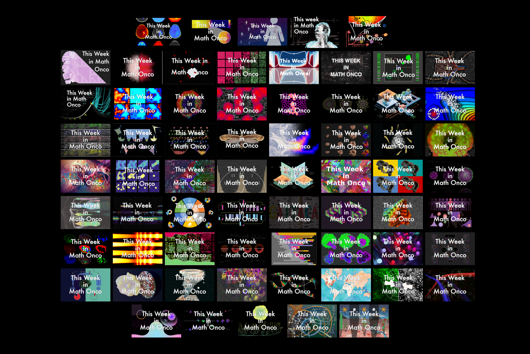
“A picture says more than 1000 words”. With this proverb in mind, I defer to Figure 1 which shows all 67 pieces. For the more quantitative minded, here are some stats:
- 67 – the total number of covers we have solicited since we started last May.
- 13 - the number of times a cover paper has been the most looked at paper that week.
- 75 – the number of clicks the paper associated with a cover gets on average.
- 3rd – that’s how this number ranks compared to other papers in the newsletter (median).
- 2682 – the average number of views of a cover on Twitter.
- 83 - the total number of people who have (co)-authored a cover.
- Atchuta Srinivas Duddu and Ryan Schenck – congratulations, you are the top cover makers, each with 4 covers to your names.
- 14 – that's the number of you who have contributed to more than one cover.
Finally, as a byproduct of showing all this cool artwork, we decided that it was time that the newsletter itself got a brush up. We have always loved chalkboard theme, and so we designed the banners that are also in action in this post (based on an initial design by Jill Gallaher). Note the “we” – design is teamwork!
Follow your gut and don’t let yourself be held back by thoughts about not having the required artistic skills. I am pretty bad at drawing and arts was one of my worst subjects in school. But with the kind of digital art that we are creating, your fine motor control doesn’t matter as much (if we want a painting to look like a van Gogh there is always a
neural network to do this for us). What matters is that you enjoy playing with colors, shapes, digital effects, and different arrangements thereof. And don’t be afraid to add a personal touch, such as clonal Arizona deserts (cover #
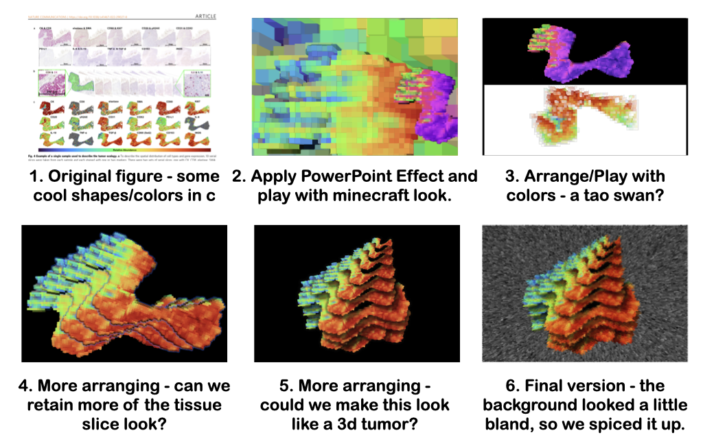
226). Experiment and get feedback from others! When I create a cover, I often go through multiple iterations (many of which are dead ends) and bounce ideas off others on the team. To illustrate this, Figure 2 shows our route to cover #
204.
A note on tools: While graphic editors such as Adobe Photoshop, Gimp, or Inkscape give you a lot of fine control, Power Point and Keynote are great starting points. Power Point has a number of powerful “artistic effects” with which you can turn plots from your paper into cool looking art (e.g. Cover #
198). Keynote has a great selection of shapes and lines styles (e.g. Cover #
165). Color is key. If you’re looking for inspiration, I recommend the
xkcd color palette. And who knew? - if you’re looking to create a tornado,
you can do so in R!
Avoid lunchtime conversations…
Just joking! With the first in-person SMB just a few days away it seems very fitting that the biggest take-away for me is the value of community. From the casual lunchtime chat which started this, to the many emails I’ve exchanged with the authors of artwork since, this project has really shown me the creativity that emerges from conversation. It also has made me aware of new research and tools, such as Artistoo, Isomatrix, VALIS, MISTIC or DALL-E. More than anything though it has demonstrated to me what a fantastic community we have. Out of the 50+ cover invitations I have sent, less than 5 have gone unanswered.
Thanks to the many of you who have contributed to this project over the past year, and to Jeffrey and Sandy for their help as part of the editorial team. If you have any feedback or would like to submit artwork, feel free to reach out to me at any time, or catch me at SMB this week!